


Precise color reproduction in print is the key to maintaining visual brand consistency and the effectiveness of an advertising campaign. The Pantone system has become a global standard in this field, which allows precise color definition regardless of the medium. However, transferring Pantone colors to different materials, such as paper, plastic or cotton bags, can be a challenge. Learn what to look for to achieve the best results.
What is the Pantone system and why is it so important in printing?
The Pantone Matching System (PMS) is a global color identification standard that enables accurate color reproduction on different surfaces. Unlike the CMYK system, where colors are created by mixing primary colors, Pantone offers uniform colors defined in patterns.
This allows designers, printers and customers to communicate in a uniform color language. This solution eliminates the risk of differences in color interpretation and guarantees the visual consistency of advertising materials around the world.
How does Pantone differ from CMYK and RGB?
CMYK (cyan, magenta, yellow, black) is an offset printing system in which colors are created by overlapping basic inks. RGB (red, green, blue), on the other hand, is the system used in computer and phone screens. Pantone colors, unlike these systems, are uniform and independent of the mixing process.
As a result, Pantone colors can be reproducible, regardless of the device or printing technique. For example, metallic shades of gold or silver are only available in the Pantone system, making it indispensable for custom colors.
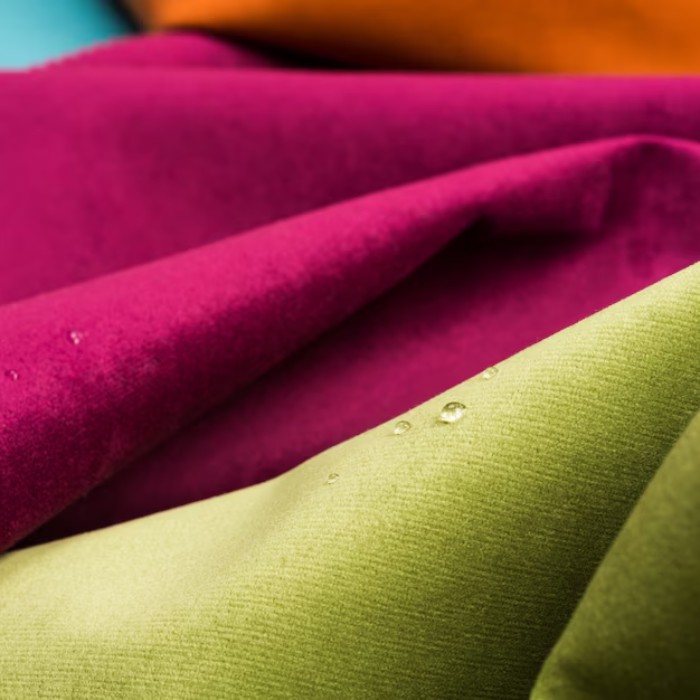
Challenges of printing on different materials
Printing on different surfaces, such as paper, plastic or fabric, presents some difficulties. For materials such as cotton bags, the texture of the fabric and its absorbency can affect the final color result. Pantone color can look different on smooth paper and on rough cotton.
These differences are due to the absorption of the ink and the way the fabric reflects light. That's why it's a good idea to order a sample to see how a particular color looks on a particular material before starting a larger production run.
How to avoid color disappointment?
The first step to avoiding surprises is to use physical Pantone color swatches. Digital color previews can be misleading, as monitors vary in calibration, brightness and display technology.
A print test is also an important part of the process. It allows you to assess how a given Pantone color looks on the selected material. If the result deviates from expectations, adjustments can be made before mass production begins.
Why is Pantone the best choice for your brand?
By choosing to use Pantone colors in your advertising materials, you are investing in consistency and professionalism. This system allows you to achieve an identical effect on different media, which is crucial for building a recognizable visual identity.
In addition, with its unique shades and wide range of colors, Pantone gives you the opportunity to stand out from the competition. The right color can become the hallmark of your brand and become memorable to your audience.
Colors from the Pantone color palette - summary
Pantone colors are an indispensable tool for anyone who wants to accurately reproduce colors in print. Although the process of transferring these colors to various materials, including cotton bags, can be demanding, proper preparation and cooperation with an experienced printer allow you to achieve excellent results. With Pantone, your advertising materials will not only be aesthetically pleasing, but also consistent and professional. Invest in quality and precision - a step towards your brand's success!